SAMI Branding Guidelines
The SAMI icon is the official badge of the Science-Based Artificial Intelligence/Machine Learning Institute (SAMI). The icon is to be used to represent the SAMI program and in publications, presentations, and other visuals for the SAMI program. Use the icon as intended without variation to the below guidelines.
Color Variations
The official icon with gradient color should be used primarily. There may be times where the design requires alternate colors to be visible. The accepted color alternates are the blue-green combination without the gradient, gray, all back, or all white. No other color options are permitted.
Clear Space
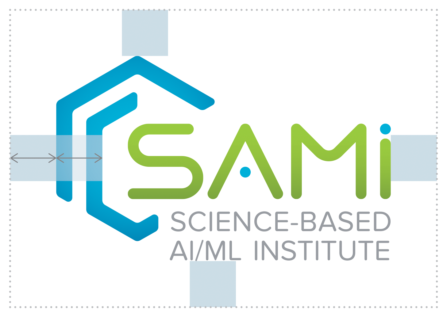
It is important to be conscious of the amount of space used around the icon, especially when it appears with other icons. The clear space helps establish the importance of the icon in environments where it competes with other graphic elements for attention. No matter what size icon you are using, use a buffer equal to the width of the two bands of the SAMI symbol to determine the appropriate amount of surrounding space, which increases or decreases proportionately with the size of the icon. Please allow for more space whenever possible.
NETL Co-Branding
There may be instances of co-branding the SAMI icon with the NETL logo. The NETL logo must appear on the left of the co-branded SAMI icon; and the two icons must be separated by a bar. The bar must be spaced using the stylized “E” width, centered between the co-branded SAMI icon and NETL logo. The height of the co-branded SAMI icon and NETL logo must be no taller than the height of the “NETL box.”


